
Rebranding a Salesforce Partner Company
Advocating for design as the team’s only designer
Executing a full rebrand wasn’t in my job description as the Digital Marketing Manager at Growth Heroes — but I felt passionately that a change was in the best interest of the business, so I made it happen on top of my regular client workload.
I pitched the first concept for the rebrand before I even accepted the job offer. Then, I was given a two-month timeline to complete the entire branding process and launch a new website before an annual conference. I created a highly effective brand identity and website design (complete with all-new content) focused on the concept of growth.
In the process, I directed and managed a team including an in-house content strategist and a freelance web designer to launch the site. Then, I created clear design systems, brand guidelines, and templates, to help the small team of non-designers execute the new brand.
Services:
Creative Direction
Brand & Marketing Strategy
Brand Identity Design
Website Design
UI/UX Design
Project Management
Copywriting & Direction
Content Development
Digital & Print Marketing Collateral
A focus on growth
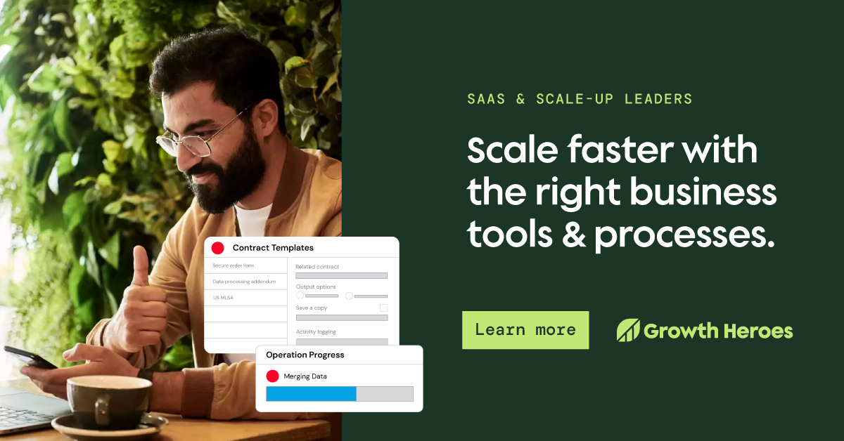
Challenge:The Growth Heroes brand was due for an update. There was no clear brand strategy or design system, and the website did not meet WCAG 2.1 Accessibility requirements.
I saw an opportunity to better tell the story of how the Salesforce consultancy supported its clients through digital transformation. The previous branding focused on the “heroes” element of the brand with a superhero theme, but I wanted to emphasize the real heroes — the company’s clients and their incredible growth results.
SOLUTION:Starting with discovery, research, and strategy, I created two concepts concepts for the new brand identity. After collaboration and feedback, I delivered a highly effective, refined brand identity focused on the concept of growth.
I also managed content strategists Cassidy Belk and Rachel Dupont, who reimagined the site’s architecture and wrote fresh copy that felt approachable and human.
Then, I designed a new website, collaborating with a web developer to launch on a short timeline.
RESULTS:The launch of the new brand and website was a huge success, with positive feedback from executive leadership, clients, and digital transformation professionals.
Website traffic increased by 104% post-launch (Q/Q).
Social following (LinkedIn) increased by 49% YOY from Q124 to Q125.
Social engagement metrics increased by over 50% post-launch (Q/Q).
I also won the company’s award for “best presentation” in Q124 when I revealed the new brand to the team and walked them through the strategy and purpose behind each decision.
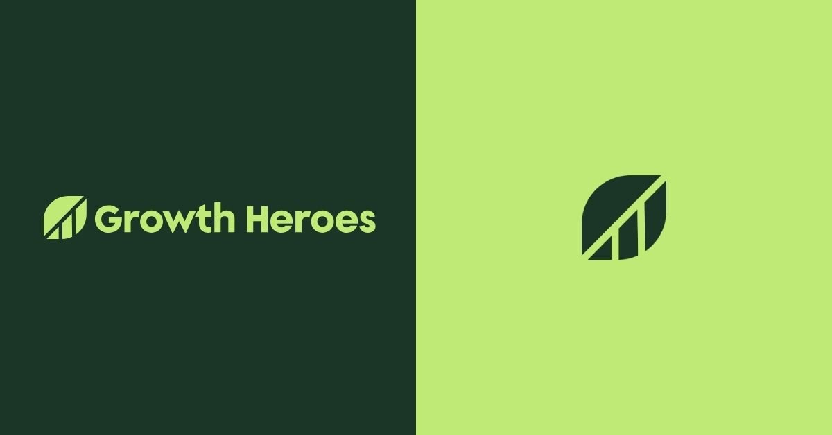
The new logo
ImageryThe negative spaces of the leaf icon reveal a bar chart showing consistent growth.
TypographyThe Supera Gothic typeface, used in previous iterations of the Growth Heroes logo, feels more friendly and modern in title case instead of all caps. I customized the typeface for the logo, ensuring harmony between the letter forms.
I chose DM Sans and DM mono as supporting typefaces for the brand, which felt complementary to the rounded, geometric forms of the primary typeface, just simplified for body copy and accents.

The new color palette
Green for growthGreen represents growth and profitability. In color psychology, green also signifies renewal and abundance.
A dark green is the foundation of the brand. In addition, the primary palette includes a collection of green shades, including an eye-catching accent green that feels friendly and tech-appropriate.
I engineered the color palette to ensure WCAG 2.1 AAA accessibility compliance, with sufficient contrast to ensure readability for as many people as possible.
Illustrations & iconography
I customized leaf motifs and graphic callouts to add visual interest to the brand’s graphics and to layer over images.
A consistently styled icon set includes symbols representing the teams’s service areas and more. I even created customized icons for the company’s core values.

Brand activations
Client appreciation giftsI recommended a new client appreciation gifting program through Lively Root, a plant vendor that sends branded gifts — money trees, to represent how GH helped clients grow their profits. We received positive feedback from happy clients, and photos of their growing trees.
Plantable business cardsBusiness cards are printed on plantable paper that grows wildflower seeds.
Slide decks & templates
The company did not previously have an RFP template or process, so each RFP required an inefficient amount of hours from leadership. I convinced the CEO to utilize a user-friendly Google Slides template I designed, complete with pre-made pages and customizable slides to meet any requirements. My work saved dozens of hours for each subsequent RFP.
I also QA’d each proposal response to improve the design and messaging before sending decks to prospects.
I even created Google Slides templates for internal use, as team members each give a monthly presentation on their technical expertise.

BeforePrevious website home page

The old Growth Heroes brand and website were ready for an update. The brand felt a bit messy and disorganized. Plus, the existing site did not meet WCAG 2.1 accessibility standards, putting the company at legal risk.
Through competitive research, I found that the blue color palette and abstract look and feel were common among Salesforce consultancies, which made it difficult to stand out in the market.
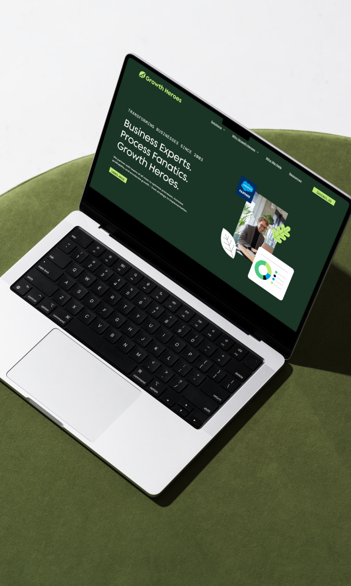
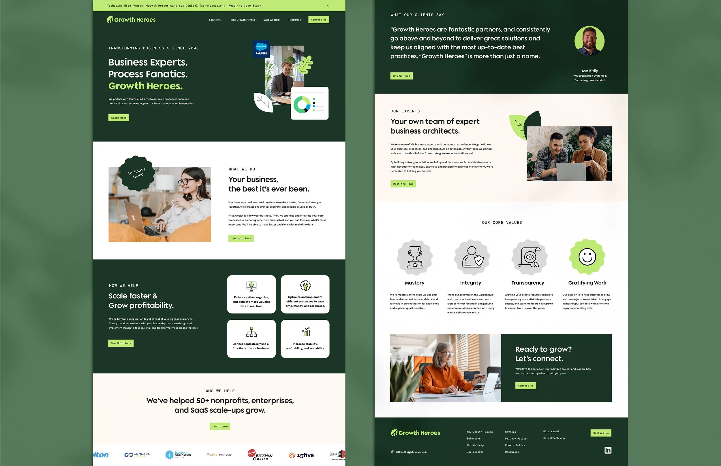
AFTERNew website home page

I designed a new, modern website with consistent brand typography, a color palette that felt unique in the market, and distinct styling for customized iconography and leaf illustrations.
I sourced stock imagery that represented the team’s experts and clients in various industries. The entire website now passes WCAG accessibility requirements, thanks to the new design system I carefully developed.
Scope & deliverables
I delivered the following: Brand strategy & foundations
Brand identity design
Website design
Brand guide (INDD & PDF) development
Iconography & illustration design
Business cards
Slide deck templates
Email banner graphics
Google Docs design templates
Social Media templates & campaigns - Linkedin
Paid ads & demand gen assets - Linkedin, Google Ads, Reddit
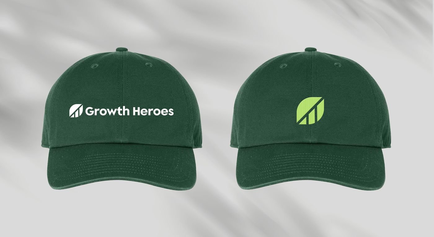
Swag & workwear art direction
Project management
Creative direction
Headshot photography
Client appreciation gift direction


Demand generation
I designed a set of LinkedIn ads for a campaign targeting the company’s four main personas within its ICP. I also created the ad strategy and wrote the copy in partnership with Cassidy Belk, our content marketing strategist.
To create efficiencies, I set up user-friendly templates in Canva and ad guidelines so that anyone, even non-designers, could easily produce more in the future.


Organic social content
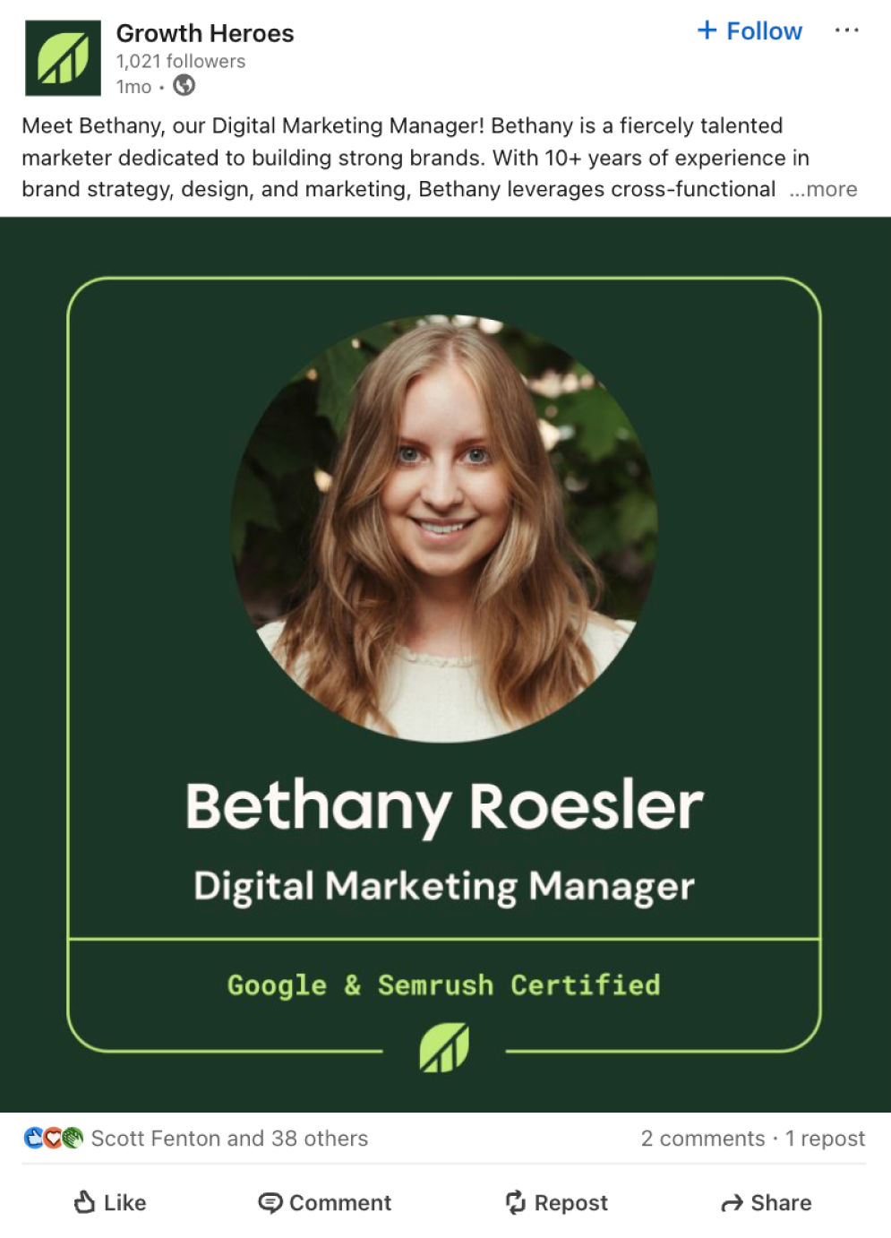
When I started at Growth Heroes, the brand was barely posting organic content. As part of the new brand launch, I led a social media content strategy. I developed a “Meet the Team” series to highlight the team of experts and designed templates for easy production in Canva. Working with content strategist Cassidy Belk, I wrote half of the team’s bios and helped create a process for content production for each new hire. This series received the highest engagement metrics to date.


This work is owned by Growth Heroes.