
Brand Identity for Lane Visuals
A Timeless Brand for an Artist
Challenge:
Julia of Lane Visuals approaches her work with an eye for the intimate moments that tell a couple’s love story without a word. Julia came to me looking for branding that felt authentic, timeless, and elevated to appeal to her destination elopement & intimate wedding target clientele.
Solution:
We started with a brand discovery exercise to identify brand values, taglines, and a brand personality profile.
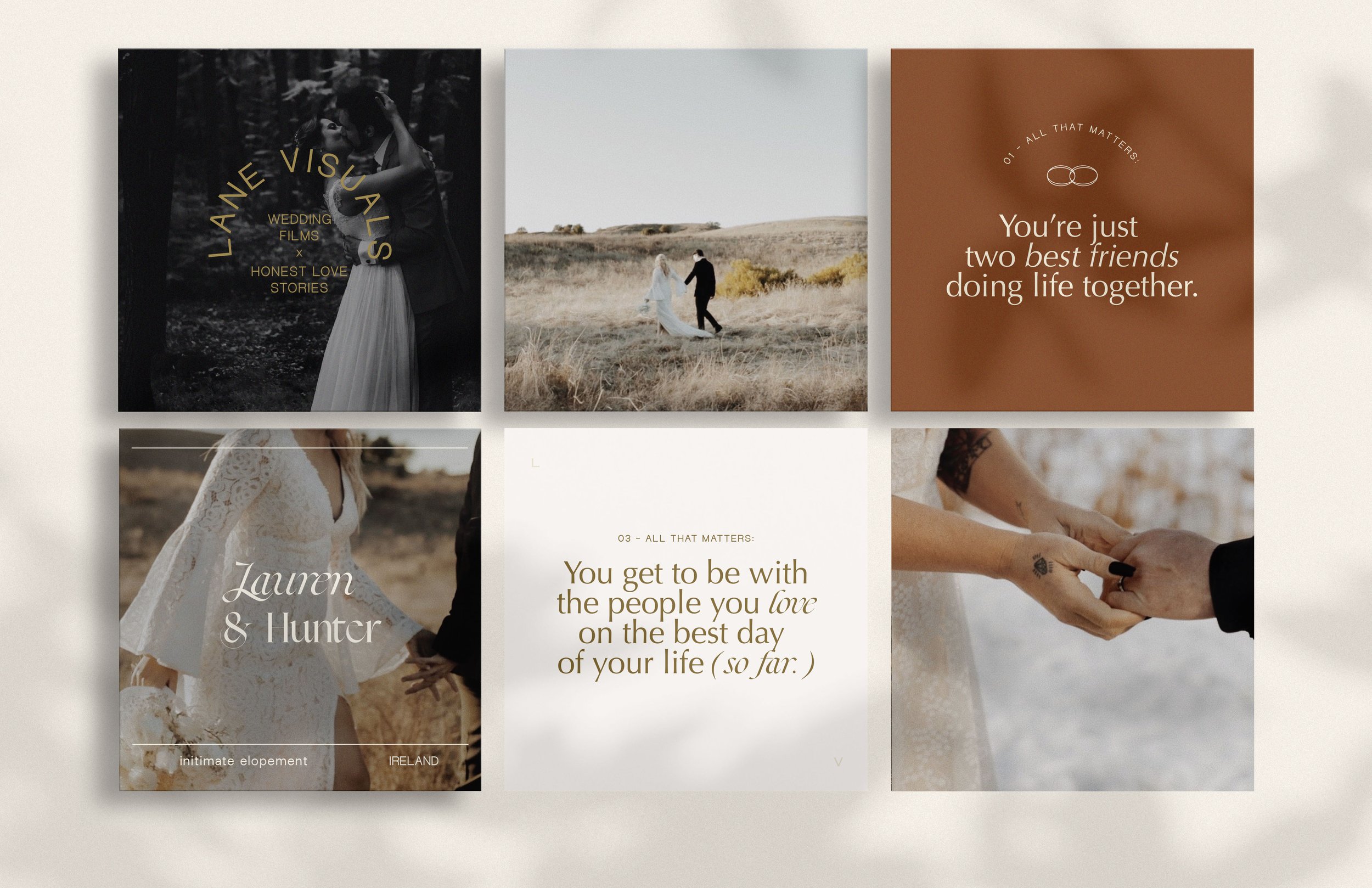
I chose a muted color palette inspired by the East and West coasts, where Julia has called home, and typography that felt both vintage-inspired and modern.
A set of secondary marks includes a symbol of two intertwined wedding rings, which creates the “infinity” symbol to represent the coming together of two people in love.
Results:
Julia loved her new branding. She was able to target clients in her ICP and continues to create beautiful, story-driven wedding films.
Services:
Brand identity design
Brand strategy & discovery
Brand style guide development
Print & digital collateral


Original Concept
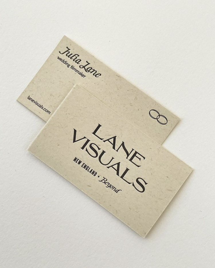
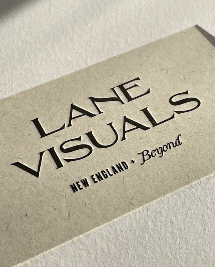
One of my favorite parts of the branding process is seeing how the concept evolves from its beginning stages to the final product. We decided to tweak the original business card design and typography selections to get the perfect balance of modern and timeless. When Julia told me she wanted to letterpress the cards, I was delighted — and it meant making some changes to the layout to get the best results. We even decided the design was strong enough to go monochromatic, and let the sustainable paper selection really shine.

Alternate Concept
With client work, I always like to present at least two options. This secondary concept feels earthy and vintage-inspired, combining the timeless elegance of Julia’s work with her down-to-earth presence.

Images by Sarah of Sarah Bloom Studio, the letterpress artist who produced the business cards. This work is owned by the client, Lane Visuals, with the exception of the conceptual imagery in the social graphics and style guide. In the conceptual phase, imagery was pulled from Pinterest to establish a look and feel only.