
Brand Identity for Lotus Learning

A Peaceful Place to Learn
Challenge:
Lotus Learning creates an inclusive, inviting environment for students to learn and grow. When Brandy came to me, she had a clear vision for the style and purpose of her brand, but needed support in elevating the concept and bringing it to life.
Solution:
I created a foundational brand kit aligned with Brandy’s teaching style and the unique, welcoming approach she offers students. We wanted the branding to appeal mainly to the target audience (parents likely in their late 20’s to late 40’s with homeschooled children ages 9-13). The branding needed to strike a balance between feeling elegant and kid-friendly, modern and timeless.
In my approach, I considered Lotus Learning’s small business needs and thoughtfully prepared a brand kit that could grow with the business for years to come.
Services:
Creative direction
Brand identity design
Brand strategy & narrative
Print & digital collateral
Brand Concept
Brand Concept

Brand NarrativeLotus Learning creates an inclusive, inviting environment for students to learn and grow. Here, we teach the threads that run through and encourage students to find the connections between everything.
This is not your typical approach. In fact, we work hard to undo many of the rigid patterns instilled in students from those environments. Kids can be kids here. We invite students and their guardians to experience a conversational and peaceful place to ask questions and explore new ideas.
Like the lotus flower growing through the mud, we believe something beautiful can grow through challenges. Our work helps students bloom.
Brand Identity
Brand Identity


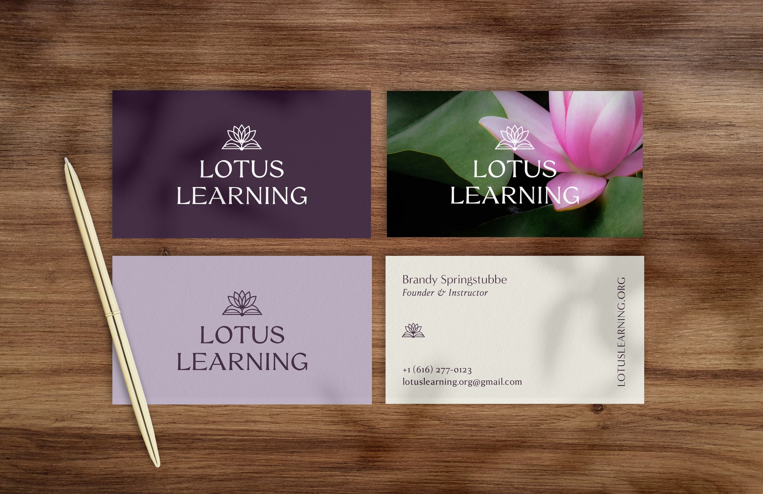


Lotus Learning’s New Logo
For the custom wordmark, I combined a lotus flower with a leaf motif that doubles as the abstracted shape of a book. The petals of the flower intersect, representing Brandy’s approach of teaching “how things connect” and “the threads that run through”. The open book represents curiosity and openness.
A sans serif display typeface gives the logo a modern and elegant feel.
The icon can also stand on its own as a smaller mark for some applications.
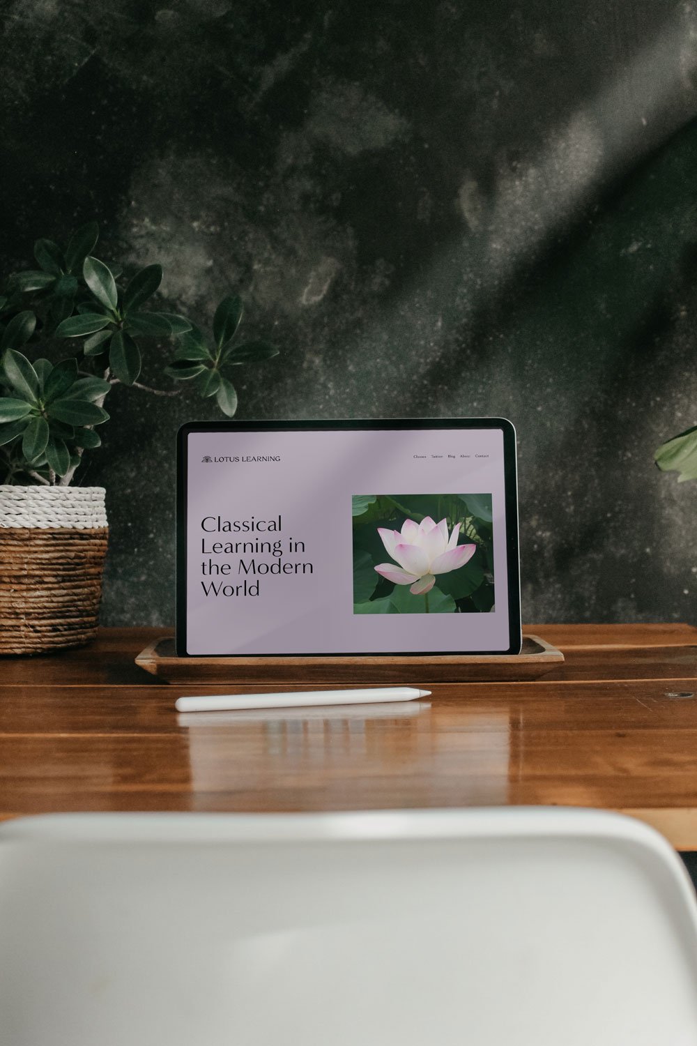
A Calming Color Palette
A sans serif display typeface gives the logo a modern and elegant feel.
The icon can also stand on its own as a smaller mark for some applications.
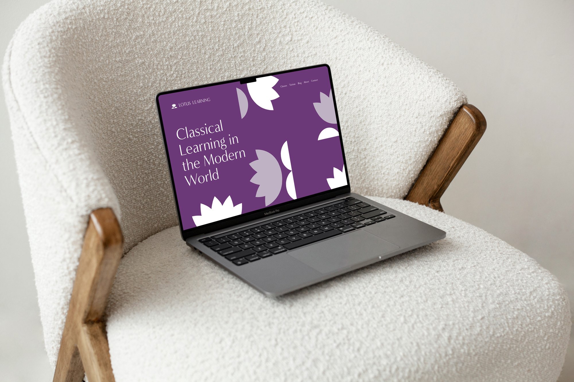
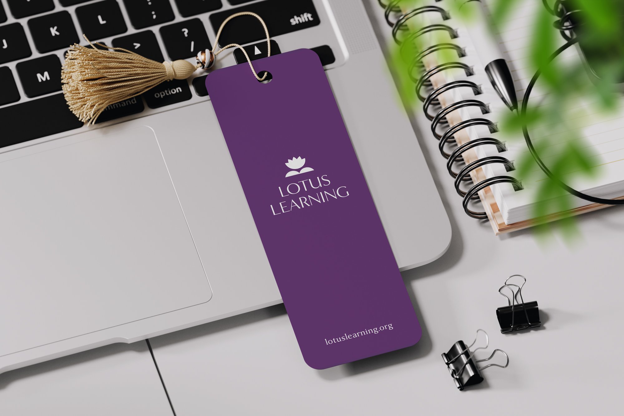
A Versatile Pattern
For the brand pattern, I separated out the lotus and the book/leaf iconography from the logo. The pattern provides an alternative to stock photography for brand collateral like bookmarks, notebooks, and totes.


Alternate Concept
*
Alternate Concept *
I typically present multiple options for brand identity concepts, “dialing up” different elements of the brand narrative in each one. For this concept, I wanted to provide an option that felt a little different than the first two — showcasing a youthful, modern approach to the brand identity inspired by the kids Brandy works with and the playful environment she creates.

This work is owned by Bethany Roesler and Lotus Learning.