
Encamp’s Brand Evolution
Challenge:When I started as the brand designer at Encamp, the environmental tech startup already had fun, vibrant branding designed by the previous in-house designer. Now, it was time for the brand to evolve as the company scaled and went after enterprise customers.
While the foundation of the branding was beautiful, over the years, it had picked up a number of elements that were starting to feel disjointed and visually cluttered. It wasn’t clear to potential customers what Encamp really was.
Solution:Under the direction of Jess Engel, Director of Marketing, I owned a brand evolution exercise to help clean up, standardize, and prepare Encamp’s brand for its next level.
Services:
Brand strategy & discovery
Brand identity design
Digital & print marketing collateral
Web design
Strategy first
I started with competitive research and analysis, uncovering unique and ownable brand elements that set us apart in the market. Then, I revisited the brand strategy and positioning, updating them to align with where the company was headed. I led a collaborative process with leadership to identify and align on what was working and what could use a refresh.
Together, we identified the following goals:Eliminate visual clutter and increase focus on the product’s benefits
Highlight people (our expert CS team)
Keep Encamp’s signature illustration style, a differentiator in the market, but apply it in elevated ways
Standardize our design direction to make it more consistent and aid brand recognition
Drive conversion (keep it bright and impactful) while appealing to enterprise (keep it professional and polished)
“Templatize” as many assets as possible for operational efficiency and design consistency
My own goal was to increase accessibility of previously non-WCAG compliant brand elements, like CTA buttons and text styling

Designing multiple solutions
With our goals in mind, I designed four similar-but-different concepts using the brand’s existing elements in a more standardized, focused way, introducing only new elements that served a purpose.
COLORS:I engineered our colors for accessibility and presented a range of options. For each option, navy blue became the brand’s main background color, because it felt enterprise-friendly and complemented the orange accent color in the logo.
ILLUSTRATIONS:I wanted to keep the signature illustrations, because no competitor or peer in the market had anything like it. Our illustration style was a unique differentiator that felt quintessentially Encamp. However, we could apply illustration in more elevated and simplified ways.
NEW ADDITIONS:I introduced an art direction for portrait photography to highlight our in-house experts, and wanted to use more product imagery to give potential customers insight into the platform.

Concept 1 focused on prominent portrait photography of our in-house compliance experts.
Concept 2 featured product illustrations and customer logos above the fold of the home page.

Concept 3 introduced a pattern made from the secondary logo. A CTA button system of white and navy ensured the highest possible contrast.

Concept 4 featured brighter colors and an eye-catching CTA button designed to meet the highest level of WCAG accessibility standards.
Aligning on a direction
PRESENTING CONCEPTS:I presented each concept to Marketing leadership, identifying their differences and the purpose behind each design decision. With their thoughtful feedback, I iterated to create the right solution.
MAKING EDITS:While we loved the photography direction highlighting our compliance experts, operationally, it would be a challenge to photograph a fully remote team. We didn’t love the idea of using stock instead of our people. So until our next gathering, we decided to lean into an illustrated product image for the home page header.
IMPLEMENTATION:Once we aligned on a direction, I began executing new design templates — for slide decks, one-pagers, LinkedIn ads, and more. On a resource-constrained team (with one designer: me!), we chose an iterative approach, making updates in phases.

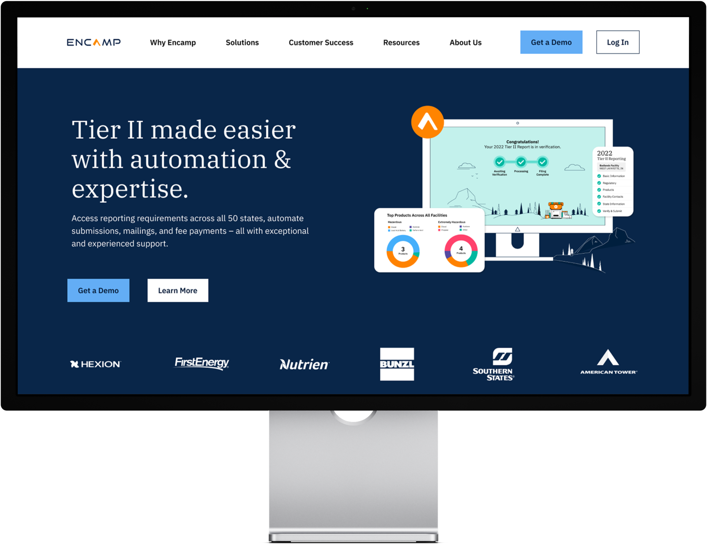
BeforeRoom for improvement

When I inherited the Encamp brand, our website’s home page didn’t feature any product imagery.
And with the use of “orange tent” stock photography, our software company could easily be confused with an outdoor gear retailer. In fact, my hunch was confirmed when our Events team received that question — “so, do you guys sell camping gear?” That was a problem: it wasn’t clear what Encamp even was.
I also wanted to move away from the use of body copy text over stock photo backgrounds that moved with the page scroll, because legibility wasn’t ideal.
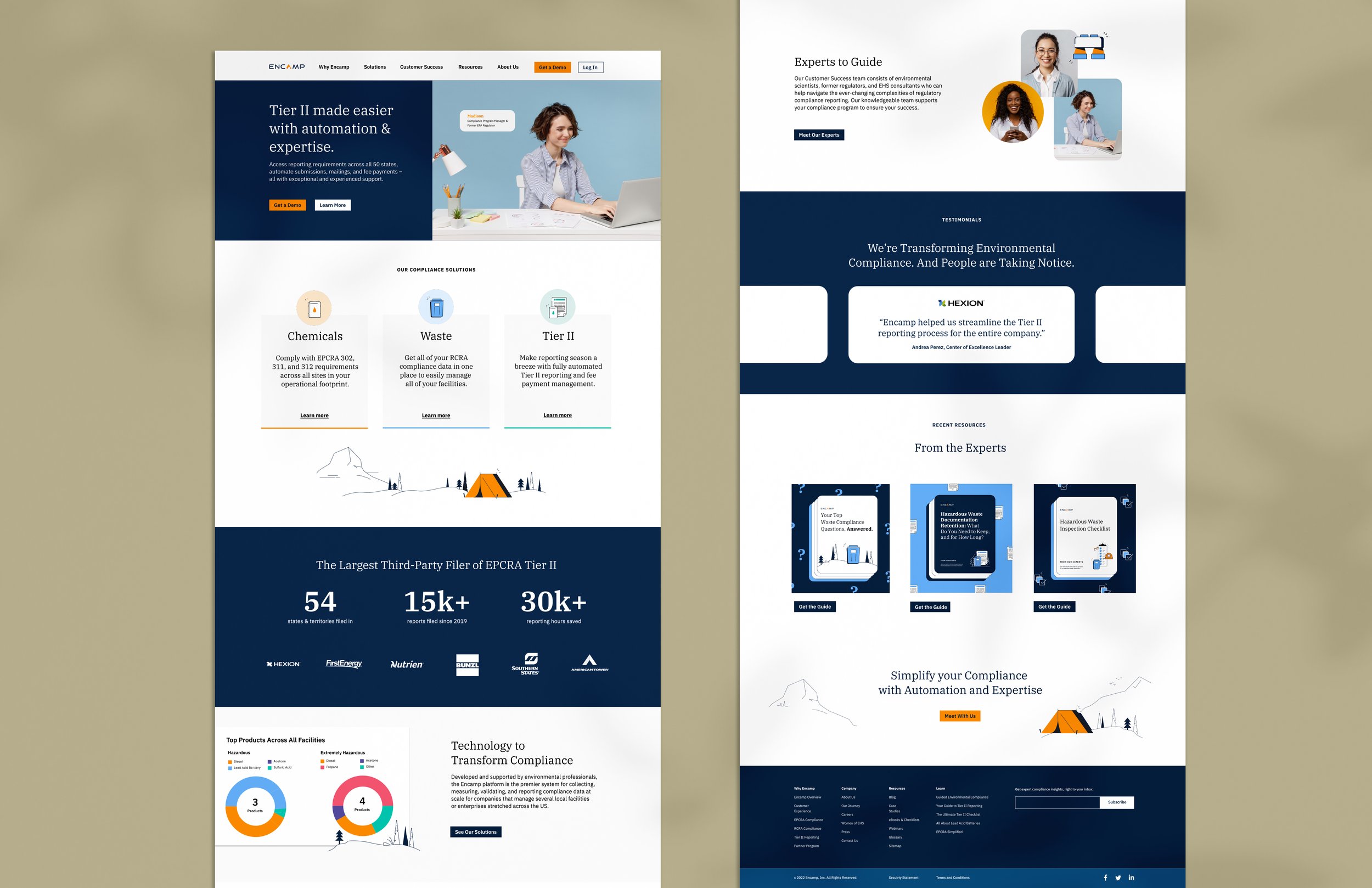
AFTERA clear & compelling home page
Product shots now appeared on sections that discussed product features and benefits, and a new testimonial slider added social proof to the home page.
I assigned an icon and color to each product area to help identify, differentiate, and sell each offering.
I even standardized the way we displayed resources, creating templates that could be easily updated.
Our CTA buttons previously didn’t meet WCAG 2.1 Standards, so I updated them — engineering the brand colors and providing several button options for our Sr. Demand Gen Manager to test.
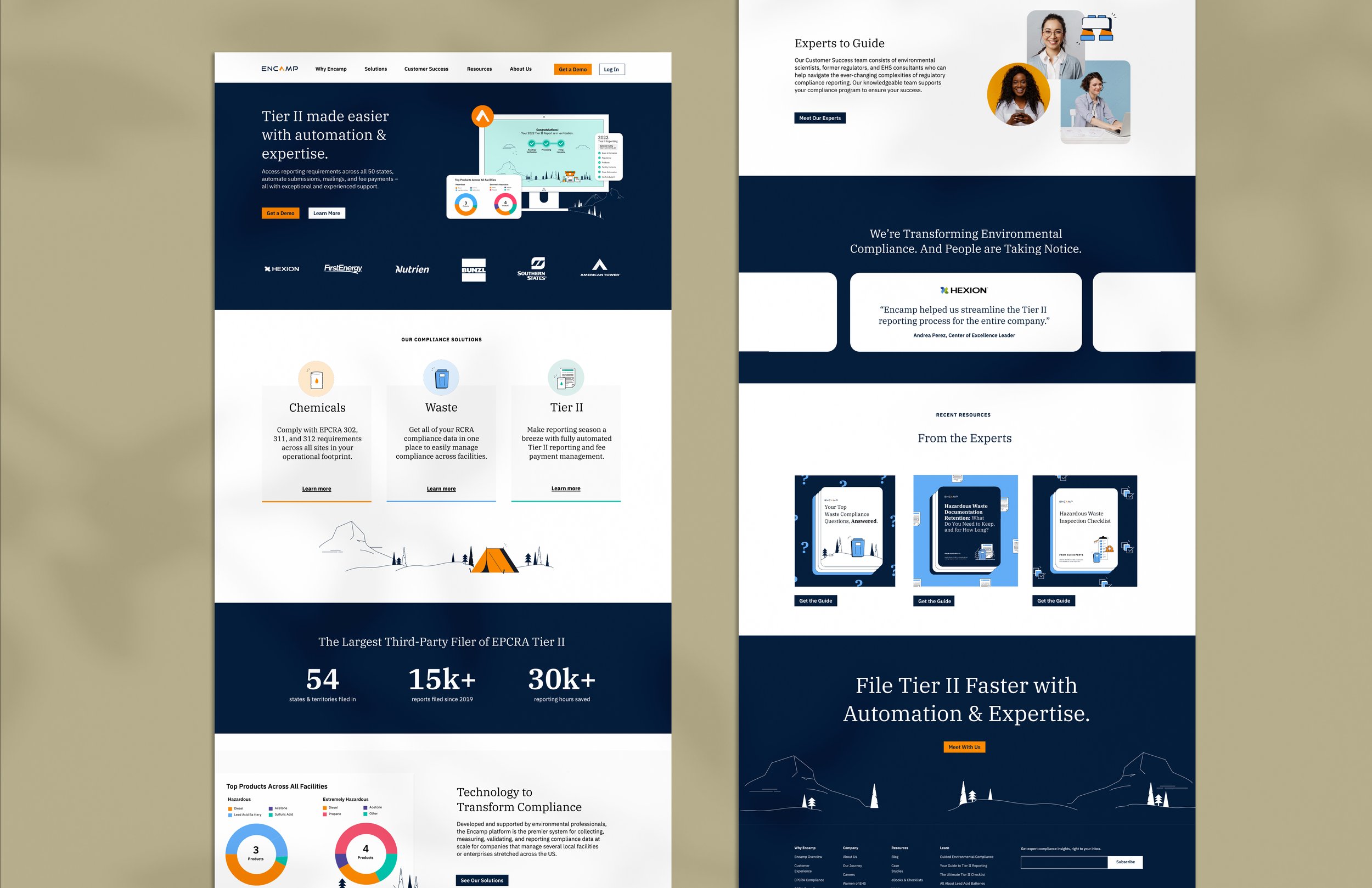
Designing across screen sizes
Once we chose a direction for the desktop version of the website, I adapted the design to optimize the user experience on mobile devices.

BeforeInconsistent one-pagers
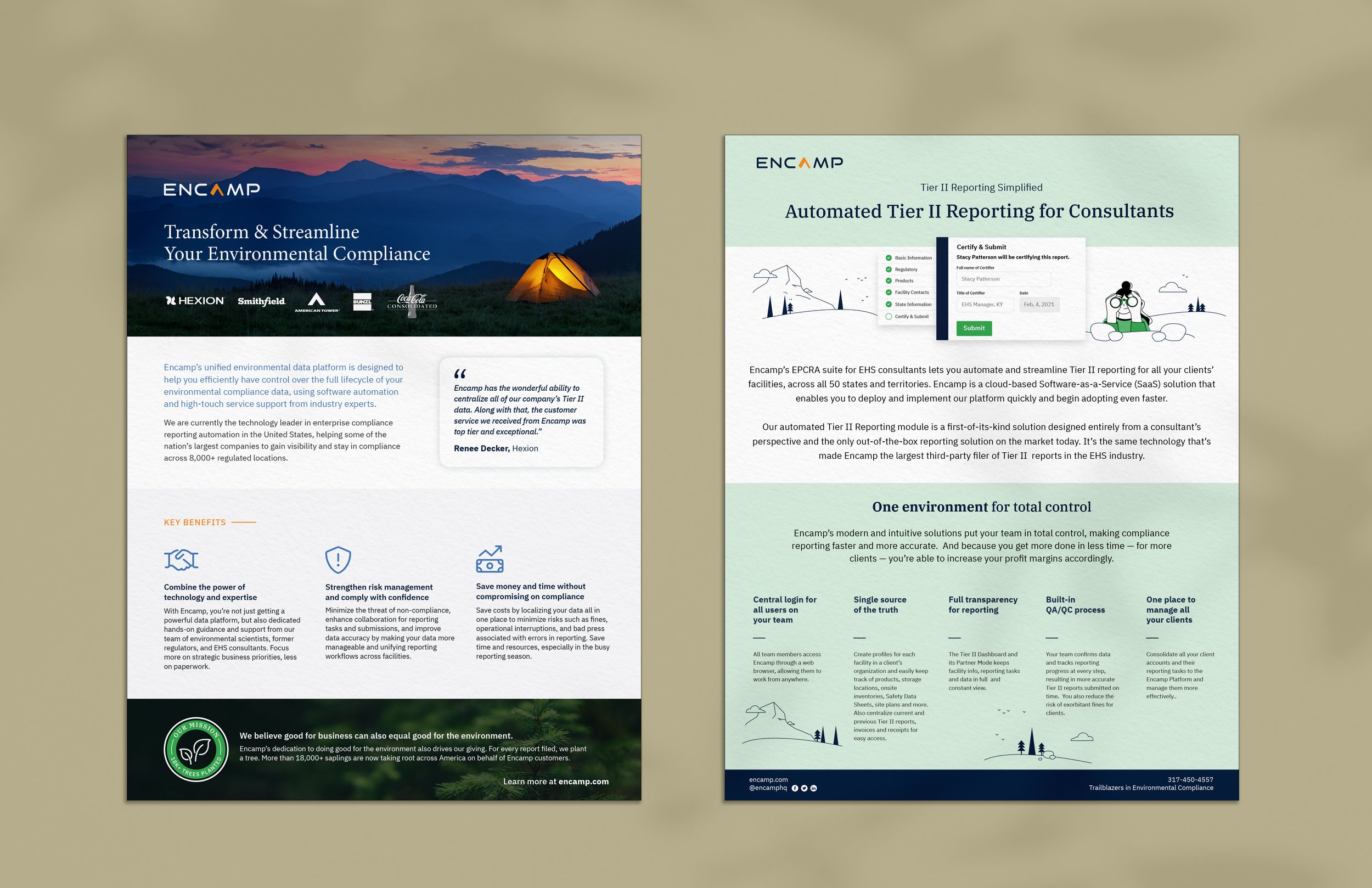
One-pagers were styled inconsistently. These examples look like they could be from two different brands. I also felt the “orange tent” stock photography made our brand look like an outdoor gear company, so I chose to leave it behind.
AFTERConsistent, templated design

One-pagers look more like the brand, with newly established guidelines around the use of color, photography, typography, icons, and more.
This work is owned by Encamp.